









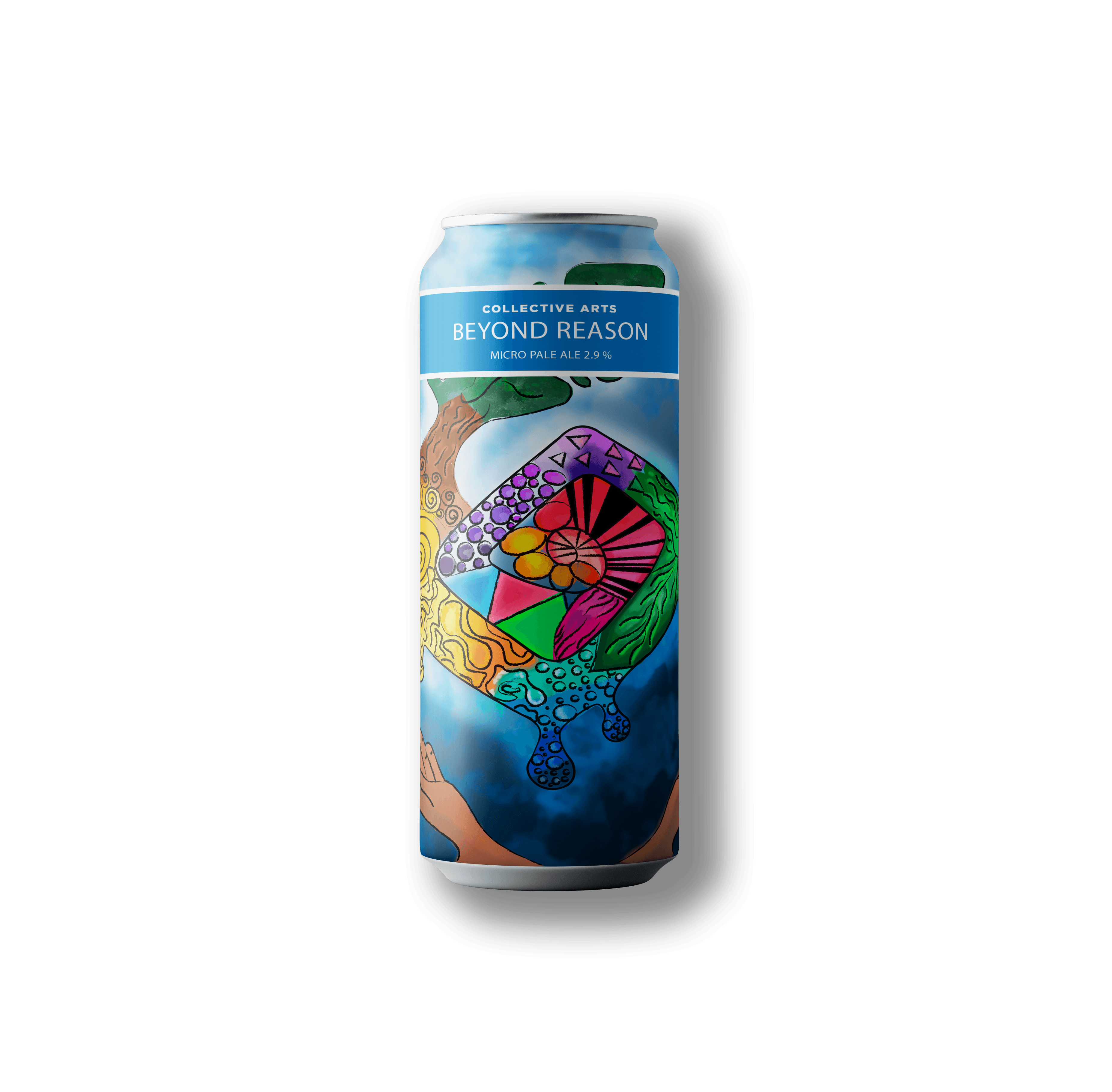
The main objective of this project was to create a can design that not only communicated the "Beyond Reason" brand, but also captured the essence of its New England IPA. The product description, with its "enveloping mouthfeel" and "explosively fruity" notes, served as the foundation for the visual conceptualization. I used a combination of bold and layered colors, with hues reminiscent of tropical fruits, to evoke the flavor of the Simcoe and Mosaic hops. The illustration style is dynamic and a bit chaotic, reflecting the beer's bold character and its promise of a "tropical bliss" in every sip, making the can stand out on any shelf.

The creation of 'THE ADVENTURER' magazine, a travel-focused publication that captures the essence of adventure and the thrill of exploring the unknown. This concept comes to life through a carefully orchestrated editorial design, from the compelling cover to the meticulous layout of each page and cohesive advertisement spreads. The entire system delivers an organized fluidity and high-impact imagery that enhances the written content. A refined palette of deep blues and golds is utilized to evoke a sense of belonging, premium quality, and exclusivity




PORTFOLIO

about


